Website Content Audit
For Alzheimer’s Disease Resource Center
Content Inventory & Audit
Overview
In summer 2023, I volunteered as a designer for Alzheimer’s Disease Resource Center, Long Island, NY, which provides education and support for people living with Alzheimer’s and other dementias and their families. This content inventory and audit focuses on improving the usability, accessibility, and SEO performance of the Alzheimer's Disease Resource Center (ADRC) website.
In this project, I identified usability and accessibility problems of the homepage of the website.
Who are the Users?
Before reviewing the website’s content, it’s essential to identify the potential primary users who visit the site. I created three user personas based on the types of content available on the website.
I categorized three types of potential users and what they would want out of the website:
1. Caregivers
2. Patients of Alzheimer’s.
3. Healthcare Professionals and Volunteers

Identifying Usability & Accessibility Problems
Upon my initial visit to the home page, I immediately noticed ongoing efforts to enhance the website's accessibility. This was evident from the presence of an accessibility toolbar located at the top right corner of the webpage. I proceeded to conduct an accessibility analysis using webAIM WAVE. Through this analysis, I discovered numerous positive elements, including the implementation of ARIA (Accessible Rich Internet Applications) and the incorporation of images with alternative text on the webpage.
Nevertheless, my analysis also unveiled certain issues pertaining to the usability and accessibility of the webpage.


Hierarchy & Organization
The menu button includes 7 headings, however some of the headings only have one subheading and could be potentially merged together for a simpler navigation.
I mapped out the menu bar navigation to analyze the website’s structure and identify any potential issues in its organization and information hierarchy
Some items, like “Corporate Sponsorship” and “Donate to ADRC,” serve a similar purpose but are not grouped together effectively. Subcategories are not always intuitive. For instance, “Art Therapy for People With Alzheimer’s” and “Music Therapy for People With Alzheimer’s” could be grouped under a more generalized category like “Therapies for People With Alzheimer’s.”
Some labels like “Virtual Recreation with Carol Hartmann” are very specific and might not resonate with all users. This should be part of a more general category, such as “Recreational Activities.”
The IA presents a lot of content at once, which can be overwhelming for users, especially those looking for specific information.
Color Use
There are several color usage on the page (for instance the menu button) that does not align with the W3C WCAG Guidlines which require the images or text having a contrast ratio of at least 4.5:1.
A low contrast design can be confusing for people with moderately low visual acuity which happens more frequently among elder people.

Redundancy
It could be convenient to have information repeated, however it could also make the interface more confusing. For example, on the home page, the button “donate” appeared three times.
Greyscale Test


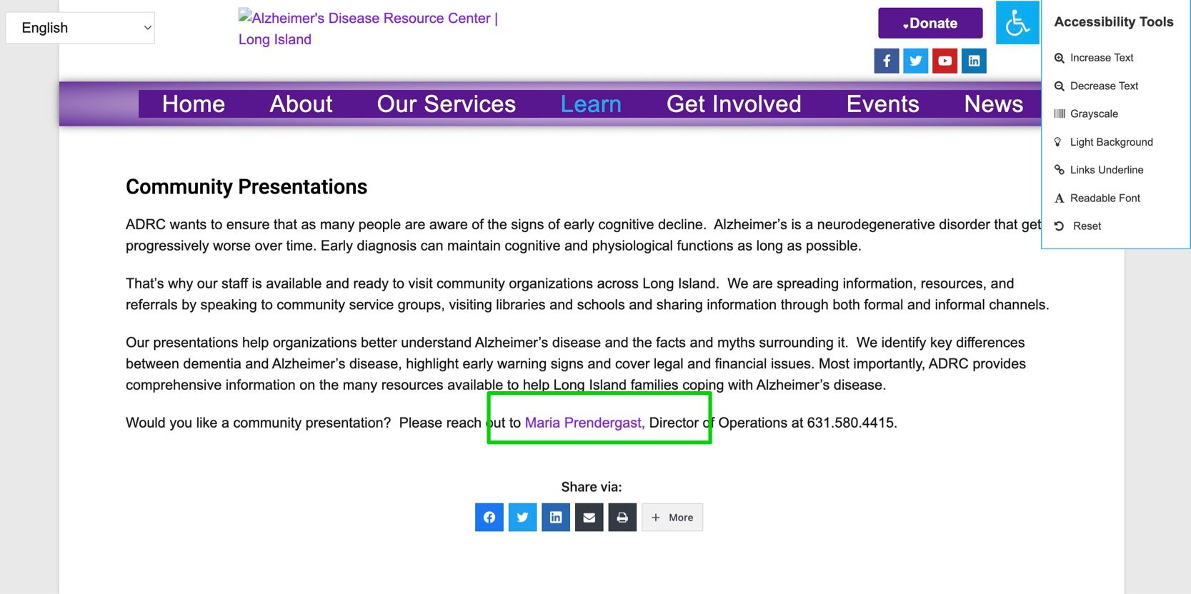
When color difference was the only way of communicating information, it can get tricky. For instance, the above left picture shows a link that is in color purple, so that people will know that an external link is embedded in the word. However when browsing in the greyscale mode, the colors appear to be almost the same. The user thus would not have known that there is a link.
Content Inventory
After my initial manual inspection, I decided to do a more systematic and thorough analysis. I utilized the Screaming Frog SEO Spider to perform an in-depth analysis of the ADRC website, ensuring a more thorough assessment of its SEO performance.


From there, I got to identify issues regarding

Readability
Meta Descriptions
Text Ratio
H1 Headings
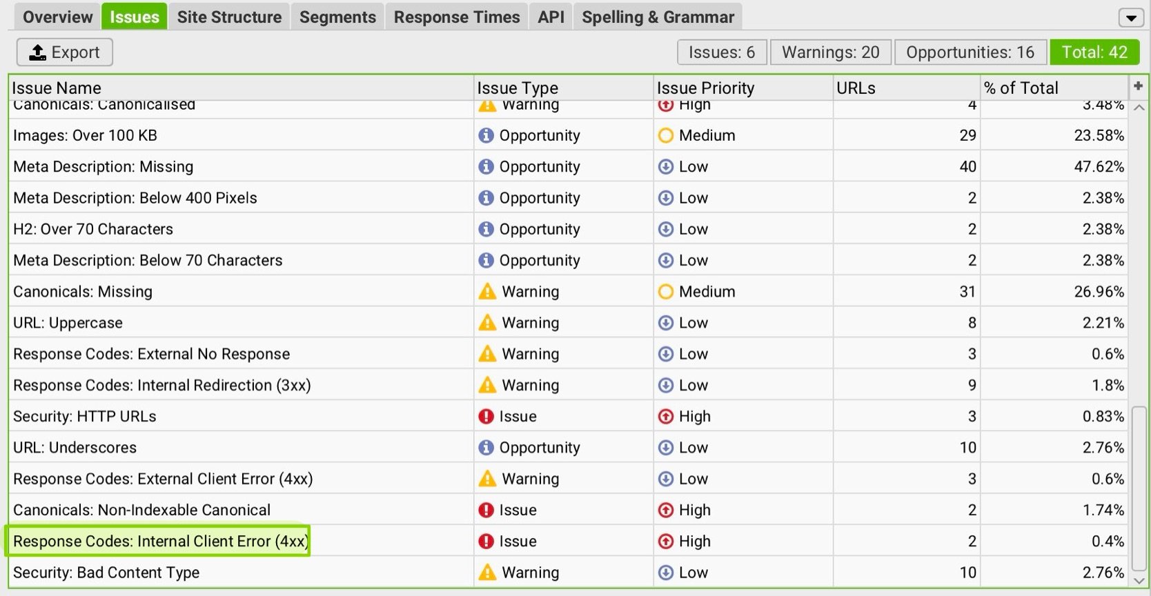
Issue #1: Response Codes: Internal Client Error
There are 2 urls from the website that have a client-side error. This indicates a problem occurred with the URL request and can include responses such as 400 bad requests, 403 Forbidden, 404 Page Not Found, 410 Removed, 429 Too Many Requests and more. A 404 'Page Not Found' is the most common, and often referred to as a broken link.


The links above are causing errors and should be either removed or fixed to improve the website's functionality. Both issues fall under the '404 Not Found' error category, indicating that the linked pages do not exist.
Issue #2: Some pages on the website do not have an <h1> tag.

65% of the urls of the website do not have an h1 tag. The <h1> tag is the main heading of a page and serves as an indicator to both users and search engines about the primary topic or purpose of that page. It is a strong SEO element that helps search engines understand the content better and rank the page for relevant search queries.
An empty <h1> tag is essentially useless for SEO and user experience. It does not provide any information about the content, making it harder for search engines to properly index and rank the page.
Issue #3:HTTP URLs

The SEO crawler encountered HTTP URLs, which are URLs that use the insecure HTTP protocol instead of the secure HTTPS protocol. It is an issue because HTTP does not encrypt data between the user and the server, making it vulnerable to interception by malicious actors. It could affect the user experience, as when users click on the HTTP URLs, modern browsers like Chrome, will flag HTTP websites with a “Not Secure’ warning, deterring users from visiting or interacting with the site and eliminating users' trust. HTTP URLs can also affect SEO negatively, as Google and other search engines prioritize HTTPS websites in their rankings.
Issue #4:Missing alt Attributes for Images
Some images on the website are missing the alt attribute entirely. The alt attribute provides alternative text for images, which is crucial to make the website accessible for users who rely on screen readers. Without alt text, the users would have no context for what the image represents. Also if an image fails to load, the alt text serves as a fallback to describe what should be there, improving the user experience.


Conclusion
By addressing these issues, the ADRC website can provide a better user experience, improve accessibility, and increase its visibility in search engine results, ultimately helping the organization reach more users and fulfill its mission more effectively.