
Spacy
Catalyst Designathon Project
What is the story?
I led a team our team of 3 (Yifan Jiang, Danni Qu, Ivan The) to attend the Catalyst Designathon held by FORGE Design Studio of Boston University.
We chose the track “coexistence” which aims to foster better ways of thriving in our homes by coexisting with other peoples in our communities as well as the natural world around us.
Meet Our Team!


Ivan The
Boston University ‘23
Danni Qu
Boston College ’24
Yifan Jiang
Boston College ‘24
What have we done?
Define the Problem
Find the Solution
Persona & Information Structure
Low-fi wireframes
High-fi design

The process of reserving spaces on campus has been both redundant and challenging for all of us. Personally, I have always found it especially arduous to book rooms for my A Capella group rehearsals. The official school website requires more than six clicks to navigate, only to finally reach the contact information for making a reservation. We wonder if all this hassle could have been avoided.
Define the Problem
User Interview
We conducted semi-structured interviews with students at Boston College to gather information on the current experience of reserving space on campus, and to figure out opportunities for improvements.
Students that were interviewed had this to tell us:
01. Lack of visibility of all available spaces at a given time

02. Complicated steps for students to book a place, especially for recurring event


03. Lack of information about the place (size, devices, etc)

Find The Solution
Our decision was to create a mobile application that enables students to easily view available spaces at a given time and to make the reservation process as simple as possible.

Ideation: Low Fidelity Prototypes

High-Fidelity Design
Typography : Helvetica
Color Palette :


CBC8FF
000000
D9D9D9
01.
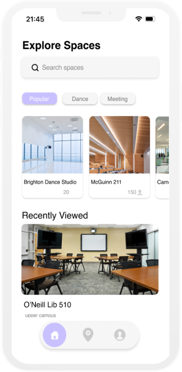
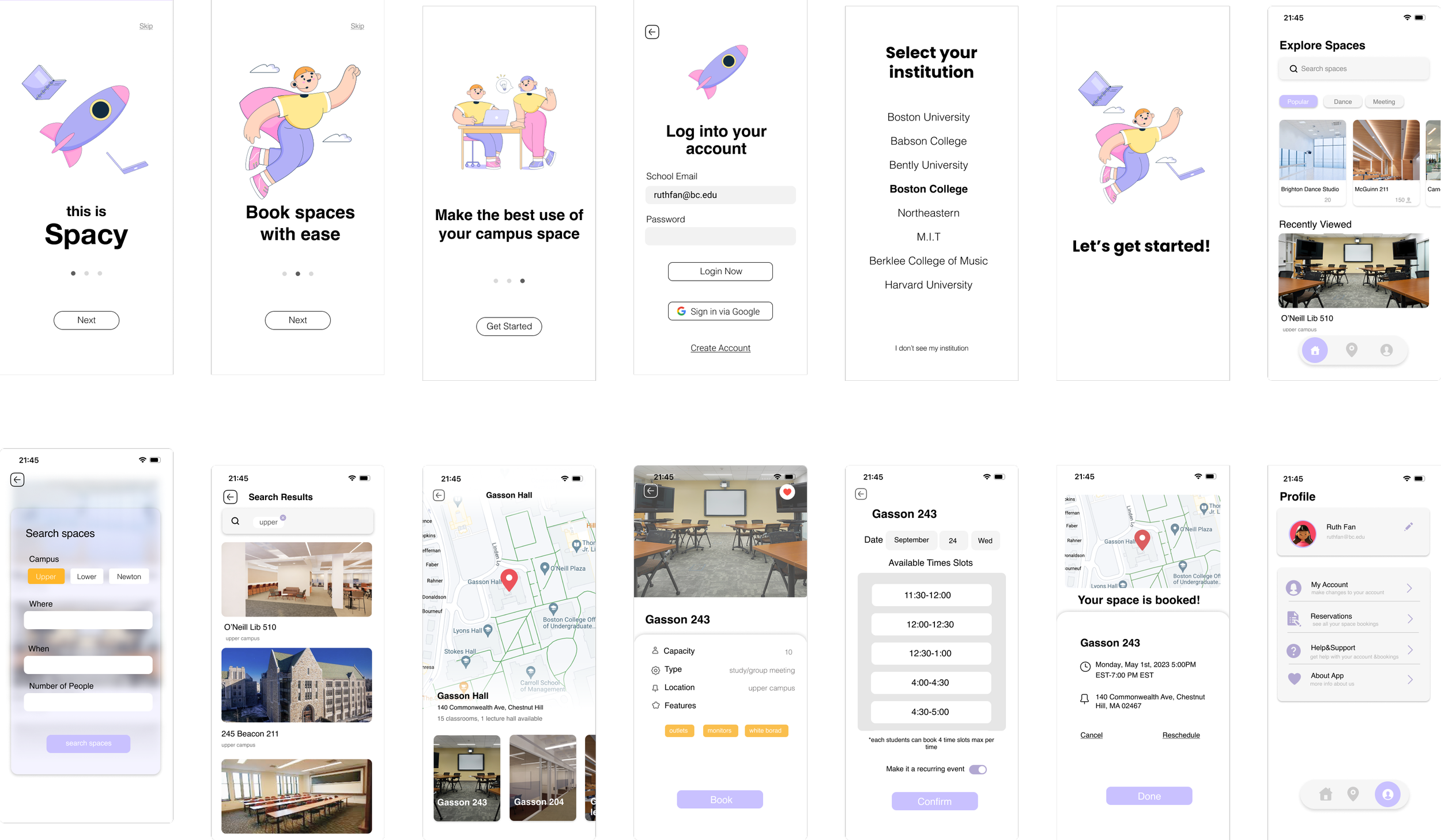
Home page
The main page of the app showcases different space options by categories as well as what the user has recently viewed.
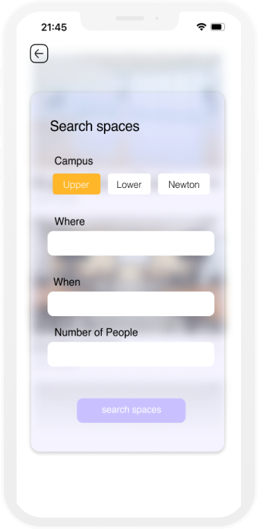
Students can also search for ideal reservation spaces and refine their results using the search page's filtering options. All available spaces can be displayed based on the selected time and the number of people.

02.
Reserve by Location
The map feature would allow users to see what’s closest to them and choose to reserve. By tapping on the buildings they choose from the map, users can check availability and make reservations. Users can also review the room's features to determine if it matches their desired space for their events.


03.
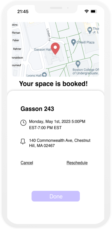
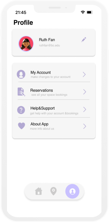
Book& Manage
Via the personal profile page, users are able to edit their personal information as well as to make modifications to their reservations.
The entire booking process with Spacy should require no more than 5 clicks, making it significantly quicker and more convenient compared to the traditional method of checking room availability online and emailing staff for reservations.

What challenges did we face during this process?
How did we address the challenges?
What features to prioritize?
According to our user research, we realized that one of the struggles students have is that there is no visual information of the space that the students are reserving. So we decide to make the graphic details of the spaces as clear as possible.
Inspiration
Our team drew inspiration from existing designs to understand the mechanics of successful designs and how they effectively convey information to users.
(left: Airbnb, right: Hi-fi wireframe of Spacy)


What is the best way to layout the information?
During the phase of low-fi prototyping, we were also spending of a lot of time in how to layout all the information available for the user: where to put the search bar? Where to put time/location?….
How to create a more customized user experience/interface?

We rethink & redesigned the homepage as the original one could not be as efficient in presenting information to the user. Although the pictures were clear (right), but adding features of small sections with categories of spaces and user history could enhance the user’s experience by providing a more personalized touch(left).
User
We also include our potential users in the entire prototyping/design process as much as possible, asking for their opinions on the way of information layout/placement of features.
Summary
Even though the design challenge lasted only for 40 hours, it provided an excellent opportunity for learning. It was a great chance for me and my team to meet other designers and developers, collaborate, and create innovative designs in a fun and competitive environment. We truly cherish the chance to hone our skills, build network, and gain valuable experience working under pressure. Our team will continue to build the project throughout the summer, touching up the design, improving the features. We’ll keep you updated!
Next: ADRC Website Audit